Pokémon Go has arguably captured the hearts and minds of Millennials, harkening back to the mid-90s when the Pokémon craze first hit. Free on iOS and Android, the game encourages players to wander their towns or explore new terrain (such as the areas near bodies of water) to find different types of pokémon.

Though this game has broken records as the highest-grossing free to play game on iOS, and has between 1 - 5 million downloads on the Google Play app store, there are still many issues (usability and otherwise) that Pokémon Go displays. Since many news sources have covered the game's widespread server outages, account troubles, and other nasty bugs, I'll stick to the usability issues.

The game's most prevalent and painful usability issue is that beyond showing the player that they need to swipe a pokéball to catch a pokémon, and can only interact with a gym once they're level 5, Pokémon Go does not spend the effort to teach players the game. Which is surprising, because there isn't too much to the game.

Post-onboarding (entering your age, speaking with Professor Willow about where pokémon are found, and choosing your avatar), there are seven elements of the game: finding pokémon, acquiring pokémon, improving pokémon, acquiring items, using items, interacting with gyms, and shopping. Of these elements, shopping within the micro-transaction store is the easiest to intuit.


Gotta Catch 'Em All


Finding, catching, hatching, and powering up or evolving pokémon comprises the majority of the game. Of these, finding and catching are the most confusing.

Finding
The primary method of acquiring pokémon is walking around your area until you run into a pokémon. Though it's never explained, players have intuited that rustling leaves on the ground mean that a pokémon might appear in that location. The other means of finding pokémon is by using the tracker in the lower right hand corner in the screen, which displays which three pokémon are the closest to your location.
Lower tracking bar

The pokémon appear in this bar are between 50 to 200 ft. from you, with each footprint equating to ~50 ft.

Quarry-specific tracker
If the player is interested in tracking a specific pokémon, she or he can tap on the tracking bar (which occasionally flashes, potentially to draw initial attention to its presence), and then tap on one of the pokémon to track that displayed in the first trailer) is that tracking a pokémon becomes a confusing game of hot and cold, where you don't see whether you're going in the right direction until you've walked ~five car lengths. While that means you're walking more, which is both healthy and productive, it can be frustrating because the pokémon you were hunting may have run away while you were going in the wrong direction. In trying to come up with more efficient ways to estimate distance to one's quarry, players have come up with various theories (proven or disproven) to potentially make the hunt easier. While consensus is that one can track distance to a pokémon by watching pokémon re-order on the tracker modal, there seems to be a desire for a more straightforward way to track closeness.

My primary recommendation here is to consider making the tracker bar flash when the player is going in the correct direction of their quarry - or at least explain why it flashes periodically.

Catching
A spearow joined me at Starbucks.

Once the player has found a pokémon, they then have the option to catch it. In the brief onboarding tutorial, the player is taught that they need to tap on a pokémon on the map to gain the option to catch it.

While the player is taught that they need to flick the pokéball within the white circle to catch it, the game does not explain the purpose and significance of the inner circle. According to Niantic's support page for the game, the redder the inner circle is, the more difficult it is to catch, and the smaller the circle is, the easier the pokémon is to catch. Since this isn't explained in the game, I've read multiple articles about how to play the game with conflicting answers (but I'll trust Niantic's, seeing as they made the game).

The other elements about catching that aren't explained are using items and how to get catch bonuses. For example, the player can get "nice throw!" or "curveball" catch bonuses -- but how one gets these is not explained.

Of all parts of the game, I would say that the pokémon catching mini-game of tossing the pokéball is the most fun -- I just wish it had been explained better.

Recommendations

  • Explain in an in-game tutorial that the player shoot shoot for a smaller circle for better chances.
  • Explain how a player can get the 'nice throw' or 'curveball' bonuses - if there's a specific goal I should be meeting to do that, I'll start altering how I toss.
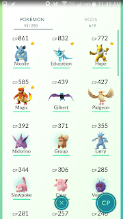

Autocorrect names my catches.
Hatching

Another way to gain pokémon is to hatch them. One of the items that players can acquire during their travels are eggs -- but while the game clearly notes when one has acquired an egg, it's not immediately clear how one incubates eggs. Over the last three days, when I've run into other new players, some asked how to incubate eggs.

To reach acquired eggs, the player needs to go to their list of pokémon, and then either tap on the 'EGGS' tab or swipe (which I discovered accidentally). Accessing this area is not clear or quick.

Once a player has found the egg section and has acquired at least one egg, she or her has the option to incubate the egg to hatch a random pokémon. Eggs are associated with a specific distance -- the longer the distance (2 km, 5 km, 10 km), the more rare the pokémon.


The player starts out with one incubator with unlimited uses, otherwise he or she can buy additional incubators from the store with three uses. An important thing to note -- that I didn't realize and I thought there was a bug -- is that when incubators are in use, they are greyed out and you are unable to select them. So if you want to be incubating all of your eggs simultaneously, you need to buy a steady stream of incubators from the store. (Which for me is dangerous, because I'm what the game industry calls a whale -- I get addicted to games and spend a lot of money on F2P games).

Recommendations

  • Consider allowing players to tap on any egg icons when they're acquired (and appear in the right side of the screen), which will then take them to the egg menu.
  • Instead of greying out the incubators, consider saying 'in use' instead.


Evolving & Powering Up

Information for Exeggcute
After a player has acquired a pokémon, they are brought to a screen like the one of the left, which shows the pokémon's information, including its health, type, and where it was caught. From this page, the player may also have the option to power up, evolve, or transfer their pokémon to gain more candies.

Overall, I'd argue that this screen is mostly clear: showing a pencil next to a name is an oft-used design treatment to show an editable field, and throughout the app, interactable buttons are a green color, and uninteractable buttons are greyed out. Because they do this consistently throughout the app, including in account creation, it's pretty clear when the player has the resources to power up or evolve their pokémon.

The one main place I see room for improvement on this screen is the location of the Transfer button. The transfer button is the last item on this page, and even if one scrolls down to the bottom immediately to transfer, they're forced to scroll a little bit more after a map lazy loads and moves the location of the transfer button. Since transferring a pokémon is actually a significant portion of the game, I'm surprised that it comes after a map that shows where you caught the pokémon.

Recommendations

  • Consider switching the locations of the map and transfer button -- since transferring is a really integral part of the game, and looking at a map isn't the locations ought to be reorganized.
  • Consider allowing players to start another power-up from the black screen where it shows the powered-up pokémon's new stats. That way, the player doesn't have to tap back and forth between screens.


Gaining and Using Items

Another core part of the game is acquiring and using items. After the player has been taught how to catch a pokémon, she or he is encouraged to go find a pokéstop, where the player can gain items. Professor Willow shows the player what a pokéstop icon looks like, but then leaves him or her to figure out how to use a pokéstop.

Here's a quote from a friend of mine, another new player:

"Maybe I missed the instructions somewhere, but the first time I went to a pokestop, I couldn't figure out how to get items from it. It was very disappointing and I left empty-handed. :( "
If the player taps on either Menu > Settings > Quick Start or Menu > Tips, she or he will be shown a brief tutorial that explains how to interact with a pokéstop. But if the player doesn't, then it's not clear how to gain items from a stop.

Once a player has gained items, she or he has the option through the menu to access the items screen. The interactions are relatively clear through this not clear is using items.

Say one of your pokémon has taken damage. You may tap on your collection of potions, and are then shown an array of pokémon who are not at full health. For a fairly long time, I thought the way to heal a pokémon was to repeatedly tap on the potion icon, then tap on the pokémon that needed healing. It was not clear to me that because I'm in the potion screen, that I don't need to tap on the potion icon to use it.

Recommendations

  • Consider changing how the tutorial is presented -- when a player reaches a pokéstop for the first time, show how she or he can interact with the pokéstop.
  • Clearly explain how using items work -- once you figure it out, it's okay, but it's not immediately clear what to do.
  • Allow players to swipe left to right or right to left on a pokéstop image - it doesn't really make sense why one needs to swipe a specific way.
  • Also, it's not entirely clear how to use an incense - to activate it, on needs to tap on the incense - tapping anywhere else gets out of the screen.
  • Why is it that one can discard items during a catching mini-game? We're not able to pick any up (right now, at least), so it doesn't make sense that we can discard. My sister accidentally discarded some of her berries this way.


Interacting with Gyms


Buggy gym battle :-(
Another fundamental part of the game is defending and attacking gyms. In the quick start tutorial (which, again, is hidden) you learn what the different icons are on the gym and how to dodge attacks, but you're never taught how to attack.

After reading through a few tutorials, I learned that in order to attack, one must tap on an enemy pokémon repeatedly, and that attacking builds up your own pokémon's ability to use a special attack. In order to use a special attack, one presses and holds to unleash the attack.

Other unexplained gym elements are what does the 'person icon' (below the CP 523 in the adjacent image) mean? Does that mean two other players were actively defending that gym when I was there? Did that mean two other players had placed pokémon on that gym?

My recommendation is that Niantic create a detailed and timely explanation of how one interacts with gyms. Once a player chooses a team at a gym, she or he should be introduced to how to fight (attack, special attack, dodge) and raise the prestige of their color's gym. Currently, it's a baffling experience. And please, please fix that 1 HP bug! It's rage-quit levels of frustrating.


Shopping


Overall, using Pokémon Go's shop is pretty clear. It's easy to read what the options are in the store, to see how much they cost, and confirm that you really want to purchase something so that a player doesn't accidentally make purchases they didn't intend.

Really the only thing that isn't crystal clear is the shield in the upper right hand corner of the store. After digging around, I learned that shield is a way to gain coins for the store, and the amount one acquires is based off of how many gyms the player has a pokémon defending. One can get this coin bonus once a day.

My recommendation for the shop is to explain this feature up front, the first time a player goes to the shop. I believe it's clear that there's a timer after the player taps on the icon, but what the icon means should be explained before a player feels the urge to purchase coins.


Other Usability Concerns


Before writing this post, I crowd-sourced other usability concerns and questions from my friends. Here are a few.

"I'd also complain about the way you log in. I've got 2-step authentication on my Google account, and that means I need to enter a code every time I want to log in. The app doesn't seem to save your credentials the way any other application would, so it's a pain to enter in my email address, password and code each time I open it."
"There's a radar-like pulse coming from your character, which you'd think would work like radar -- that is to say, giving you pings and little clues as to where the Pokémon are. So far, though, the rustling leaves are the only way to tell where the Pokémon are likely to be, and there's no guarantee that being in that area will lead to an encounter. There are also sparkles and glowing specks of dust rising and falling on the map, but so far I haven't seen that visual effect have any relevance."

"I'm also annoyed that you can't change your clothes after you choose team color, but they're clearly options for team colors but you don't know anything at the point when you choose clothes." 

"What does AR mean (in catching) top right? I don't want to click it because I'm focused on not losing the pokemon!" (explained) "Confusing. Isn't that what the battery saver option is for? And it doesn't save your settings so I have to click battery saver every time when I log in, and turn off the music."


--------------

Final Thoughts

All in all, I'm enjoying Pokémon Go. As of writing this, I have 57 pokémon and am at level 13. I'm hooked. But just because I'm hooked doesn't make it a fantastic game. The game has great potential, but at the moment it's almost too frustrating to play. I know multiple people who downloaded the game, played it some, and then said that they're uninstalling until some of the more egregious bugs are fixed. For those who want a reason to go outside and get exercise, and meet new people, consider playing, but you may want to wait a bit for the issues to be worked out.
Guest post by Hannah Murphy.


Fingeance, by Escape Industries, is a 4-player shoot-em-up game in which the fish (you) are trying to get back your gills that have been taken from you. The game relies heavily on a teamwork dynamic which requires strategically choosing which characters to play, as some play different roles.

The game is to be released in early 2017. Although there is much to be done, the game is still quite polished. The two main problems are the overwhelming text and the team dynamic awareness aspect of the game.


Overwhelming Text


After you’ve chosen your characters and have completed the first level, you’re shown the screen above. The screen above has three players, but ideally would have four. Players felt overwhelmed by the options and confused at the same time as to what items, known as gadgets, do for them. 

A: “I guess I was a little confused as to which abilities boosted my current gadgets and which changed my gadgets. I guess it did say. I don’t know, I guess I didn’t read that.” 
A: “This says gadget free but it’s the same color. I guess it doesn't change the gadget it makes bullets freeze”

The most important take-away from the above quote is that the player did not read the options. People don’t like to read if they don’t have to. And when it’s not clearly shown what information is priority, players aren’t sure where to start and will instead choose to read information arbitrarily.

Recommendations
  • One recommendation is to use icons/heuristics. Images that everyone universally knows could be useful so they can bypass having to take the time and cognitive energy to read more than they have to.
  • An example would be to use a “+” sign to demonstrate that an item related to healing properties. The downside of this recommendation is that it would have to be tested in order to ensure players understand what icons stand for. 
  • Another recommendation is to enlarge the highlighted areas and limit the amount of text so players can more easily process what they’re looking at. (Medium priority)

Team Dynamic Awareness


When choosing beginning characters, it’s not obvious that different selecting different roles matter. There’s is no initially incentive to choose a healer and a tank. It’s assumed that players will know that they should be choosing different roles in order to work together. This may not always be the case. I would not necessarily know the difference between a “tank” and a “bruiser” or “assault”.

All players observed were familiar with team dynamic games. All admitted that they did not initially understand that teamwork was a critical part of the gameplay. This could lead to completion issues and player frustration. 

Recommendation:
  • I recommend including an initial blurb that encourages players to select varying characters and by doing so will help them best achieve their goal (Medium priority).
  • An example would be when players are initially selecting their characters, a blurb pops up that succinctly explains that teamwork is imperative. This could be done by emphasizing different character roles by moving them above the paragraph that explains each gadget so it’s located under the name, making it easier to see.

Final Thoughts


Player A had 12 deaths, B 15 deaths, and C five deaths. This is a large variance. Perhaps consider what an ideal range of deaths would be. If the current players are all experienced and are still dying this often, perhaps some changes to health should be considered. 

While I was watching gameplay, I noticed that some characters look extremely similar. This, combined with the fast pace of gameplay makes it difficult to differentiate the characters. Consider contrasting the colors more by making one dark blue and the other teal.

Finally, consider prioritizizng learning. Currently players are learning as they go. By not explaining more about characters and goals on the front end, this takes away from quality gameplay since players are learning while playing. Gameplay would run smoother is players were not forced to multitask and given a short introduction at the beginning.


The shop menu shows the “Close” button on the right. Consider moving this to the left, swapping it with the 'Purchase' button. Since people move from left to right as they read this should help make the flow feel more natural when purchasing items.


Summary

Fingeance needs some work on clarity and efficiency when it comes to communicating character traits and upgrade details to it's audience. With some changes, the game will be more accessible to less experienced players. Overall, the game looks promising and I look forward to watching it grow into an even better game.

____

Hannah Murphy is a User Experience Researcher, video game lover, runner, and board game enthusiast. She's been playing all sorts of games for as long as she can remember, with her favorite game of all time being The Legend of Zelda: Ocarina of Time. If you're wanting to inquire about a game review, feel free to reach out to her on Twitter or check her out on LinkedIn.


Legion TD 2 is a tower-defense game in which the player controls minions and mercenaries to defend their king from opposing armies. Currently in pre-alpha, the player jumps straight into the action: right from the get-go, you have 180 seconds to set up a phalanx to defend your king. Wave after wave, balance your resources to position yourself correctly for late-game as the waves get more difficult.

As demos go, Legion TD 2 is looking fairly shiny and clean. Even though there was no tutorial, I picked up the game (fairly?) quickly. And while I'm sure the team will eventually make a tutorial, there are a few places where I certainly had questions, or I have some concerns.


173 Seconds to go before the first round...

Font Face & Legibility Is Good Overall

One of the comments I often have for early access games is that their font is difficult to read, or their UI elements are unexplained. Right from the start, I was able to hover over the icons to learn what they were. Font size is good.

The only places where I'd caution you on font are your combat alerts, the 'creatures remaining' text near the wave counter, and the resource bar below the action bar.

Alert text during Wave 5.
The varying font colors don't seem to make sense (why is Magic in pink? Armor weight in brown? Remaining enemies in grey?), and the lighter colors are very difficult to read over the road. I don't know how vital these messages are (do I really need to know if it's a Magic attack? Not sure.), but if the player ought to pay attention to them, they ought to be more legible.

Second, the text next to the wave counter is difficult to read -- it could be that the text is too narrow, and the contrast between the black and red too low. Either way, it's hard to read.

Third, the resources bar is very small, in comparison to the rest of the UI. Since resource management seems to be a large part in planning one's army, I'd expect the resource bar to be larger.

Resources Bar

Recommendations
  • Consider adding some kind of translucent background behind the text to show contrast between the alert text and the environment. 
  • Consider changing the font size or placement of the 'X creatures remaining' - it's difficult to read currently. Alternatively, if it's not entirely necessarily to constantly see how many monsters are remaining, consider implementing what Path of Exile does: in chat, one can type /remaining to see how many monsters are remaining in that area. But maybe it's better to know at all times what's left -- I'm not sure.
  • Consider increasing the font size of these resources, and potentially make this bar more prominent. I understand that that UI is currently a placeholder -- but I would recommend making this bar stand out more, considering its importance.


Where Did The Mercenaries Go? 

One question I had after buying mercenaries was, "wait, where did they go?" Because buying a basic fighter or worker had an immediate effect, I expect to immediately see the mercenaries appear next to the Barracks. Instead, it looked like the mercenaries I bought appeared closer to my king, in the "beacon" area? That wasn't at all what I was expecting, so I bought quite a few more mercenaries than I intended.

Recommendation 
After a player buys a mercenary, include some kind of visual effect. If they can't appear adjacent to the town or barracks, have some other kind of visual effect that shows that the purchase went through successfully. In your tutorial, you'll need to explain that you don't place your mercenaries -- that wasn't clear to me, and I honestly couldn't them on the map after I bought them.


Explain Terminology & Mechanics

One thing to be aware of is that not all players know what "tanky" or "squishy" means in descriptions. If you're familiar with games, you know these things, but consider that not all of the people who will pick up your games will understand those terms. Instead of using shorthand terms, be sure to elaborate. For example, "tanky" can be "strong fighters who can take a lot of damage before falling." Or something.

In addition, when you eventually make the tutorial (which I strongly recommend you prioritize before the closed beta), be sure to explain all of the controls (yes, even right click to move).

Recommendation 
Remember that not all of your players are starting out with your knowledge of the genre, and design accordingly.


Confusion About Map Setup

Another question I had was about why my fighters moved(/teleported?) near the king after they defeated the wave. I wasn't sure why they did that, and I didn't really want to relinquish control of them. I tried to select all of them simultaneously and right click to move them into the right lane -- but I couldn't do that. It felt somewhat bad to have to relinquish control and watch what happened during a round. Maybe that's just how the demo is designed, but I hope eventually I'd have more control about where my fighters go intra-round. Otherwise I feel helpless.

The other thing about map setup was I got a notification: "Don't leave your area." I'm not sure what my 'area' is. The entire left lane? Can I not move anywhere else? Why not? Aren't my mercenaries in the right lane? Why can't I have my fighters join them?


Recommendation 
If players aren't allowed to let their fighters leave a specific area during a wave, make sure that they have something else to do to occupy themselves. In addition, if you haven't considered this already, think about animating wave-survivors flying/walking/running to the bridge before the king. Having that animation would help show where the fighters are going -- otherwise it's easy to lose them.

Team Differentiation

One other issue that I had in Legion TD 2 was differentiating between my team and my opponents. Consider the following picture, for example:


Which are the enemy creatures? Which are my creatures? Who's winning? I'm not sure, entirely. Team differentiation is also difficult on the mini-map,


In the map, my fighters are pushing back on yellow's wave of monsters. Considering the size of the mini-map, and the trapezoid on top of the mini-map, it's tricky to see what cluster of monsters is mine. And woe be to those who are colorblind!

Recommendation 

  • Consider changing the health bars of enemy units to be red to black, and friendly units green to black. That way, one can tell who's winning. If you plan on having color-blind settings, green can become blue and red can become orange. There's a good Reddit thread here about changing Dota 2's settings to be more colorblind-friendly.
  • Consider giving enemy teams different shapes, in addition to colors. For example, red could always be red diamonds; yellow is yellow circles; green is green triangles; blue is blue squares. That way, a color-blind player is better able to tell units apart on the mini-map.

Final Thoughts
  • Make sure to explain combat icons! I didn't cover that in a section, because I assume you'll cover it in a tutorial.
  • The idea of upgrading a basic unit (the Aqua Spirit) into something else wasn't immediately clear to me -- I stumbled on that feature, and I'm not sure why I would want to do that as a player. 
  • Initially, I didn't realize that buttons 1 - 5 were essentially opening up different menus from which I could select more fighters/mercenaries -- I thought they were things I could place as well. I learned my mistake pretty quickly, but I thought I'd share that initial train of thought.
  • Overall, a great first start at a demo!
_________________________
Like the new shiny coat of paint on the blog?

Sorry for the long delay between writing! I was in Texas earlier this month for an interview, and then have been busy with other stuff since them. Busy bein' an adult. Or something. Next week I'll be sharing a guest post! Exciting stuff!

Until then, thanks for reading. 

Three Days, by Gore Pixel Games, is a survival game in which the player has 72 hours to escape an island contaminated by deadly mutation agent called SCP. Collect resources and craft items to build a boat to flee before the island is bombed to prevent the spread of SCP to the mainland.

As an Early Access game, there's a lot of work to be done in Three Days. The game's primary problem is that its tutorial is not an effective teaching tool, and leaves the player stranded and confused.


Tutorial Tells, Not Shows


When you start a game, you're first shown a tutorial. It goes through the basics of the game -- eat enough food, drink enough water, and keep yourself at a good temperature. The better your mood, the more quickly you move. And as you level up, you can get perks.

This is fine, as it's showing the player different elements of the screen, it moves the white box and arrow to very clearly direct the player's attention.

But while I might intellectually know that I need to craft shelter before it's night, and that clicking and dragging two items together will create a new item, the intervening steps are a mystery to me.

The problem with Three Days' tutorial is that it tells me how to play the game, but doesn't show me how. I've played about an 30 minutes of this game, and I have yet to make it through one night. In each game, I've lasted an average of 2 minutes and 15 seconds. That's a lot of deaths.

My recommendation is to create a tutorial that, instead of giving the player paragraphs to read, provides step-by-step instructions to guide the player up until s/he levels up and needs to allocate a perk point.

For example, after the player has read the prompt about the island being destroyed soon, the character's thought bubble might say, "Hm, I should create spike traps to defend against monsters at night. I wonder if I can find flint and sticks on this island." The game would then guide the player though the making and setup of the spike traps, as well as guide players through maintaining the health of their character (when chopping down a tree, the character might say, "Oh, an apple! Yum.")

The reason why I recommend this step-by-step process is because for some (I'd argue most), reading about a process isn't enough. One needs to be taught step by step how to play a game.

I know that currently the dev is planning on shortening the tutorial (I think it's great that he keeps a Trello to mark down what the changes are, and let users mention bugs), but I'd argue that the tutorial doesn't necessarily need to be shortened as it does need to be altered to show players how the game works. Going through the steps (and getting right into the action) may help make the tutorial feel shorter.

Recommendations

  • Consider changing the tutorial so that the fundamentals are taught through the character's thought bubbles, rather than paragraphs of text. (High priority)
  • Show that pressing space or E will eat food -- I saw this in Trello, but I had no idea it existed in-game. (High priority)
  • I suggest you read this article about tutorials.

Final Thoughts


  • Make sure you're proofreading your dialogue - in the beginning sequence, "destabilize" is misspelled.
  • Consider slowing down, or removing, the animation of the buttons and title on the main screen. It's distracting, because it's not clear to me what I should be clicking on when everything is competing for my attention. You can keep the background animation of the chickens/island, but animating the words is too much.
  • You might also consider reducing the number of buttons to click on here on the main screen -- if I'm not able to interact with the crafting pages, end cut scenes and such (I assume that's why they're grey), why am I seeing them on the main screen? Also, "Endless Mode" and "Tutorial" are sub-sets of "Start," so why have three separate buttons that all Start in some way?
  • I was looking at the crafting chart, and not in a million years would I have guessed that jam + sticks makes a torch. You might want to consider some other material besides jam.
  • You don't use space effectively on the screen. The text is huge (which is great), but you could forego most of the text with a more icon-driven design. Take for example, the HUD or The Flame in the Flood (shown below). This design clearly explains one's status without crowding the screen with text. The benefit of this design, versus your small bars with text, is that the status is far more prominent on the screen. If you want inspiration, check out this game.
    The Flame in the Flood HUD
  • Your crafting chart is confusing as all get-out. Click to zoom? And then when you're no longer clicking it zooms out? Plus, the lines are baffling, and woe be to anyone who's colorblind. Using color alone to mark which lines are which isn't considering players who are colorblind.

    Three Days Crafting Guide
     Why not just have the scroll wheel have an effect, or a (+)/(-) on the screen? Or you could consider doing something like Civ V where the tree is scrollable. That way you don't have the problem of not seeing all parts of the crafting tree, and you can get rid of the need for color in marking which elements go together.

    Civ V Technology Tree


  • When you die, I didn't realize that clicking on the corpse of your character would restart that level. Is that a feature or a bug? If a feature, you should mark it with a "Try Again" button or something.
  • Also when you die, you have "Exit Game" instead of "Main Menu," even though you also explain on the screen that clicking the button will return you to the menu. Why not just change the name of that button to "Main Menu" or whatever? Exit Game makes me think I'm going to return to my desktop and close the game.
  • Other confusing thing: why is a -1 shown when you're deconstructing trees/rocks/whatever? Do resources have HP? It's more confusing than it is helpful. I can already see that the durability of the resource is decreasing with the purple bar.
  • Consider changing how items are combined -- clicking and dragging can be an accessibility issue. Here's a passage from Game Accessibility Guidelines:

    Ensure that multiple simultaneous actions (eg. click/drag or swipe) are not required, and included only as a supplementary / alternative input method:

    Holding something down rather than tapping causes difficulty for one group, and moving in a precise direction causes problems for another, so combining the two into a drag or swipe multiples the issue.
    Other people rely on and enjoy these controls and find simple controls frustrating or less intuitive, so if you can, allow both.
_________________________

Apologies for the short post! Busy these days. I've got choir, jujitsu, rock climbing, D&D, and board game stuff going on. And work. That too. I'll try to keep up with the schedule, though!

I'll also be writing a bit more about usability as a whole, as I did with the two prior posts. I've been saying I'd for a while write about designing a game with usability in mind, but I feel like I need to read more up on accessibility literature to really give that topic justice. I'm going to start reading http://gameaccessibilityguidelines.com/.


PAX East was much louder and cooler than I expected. Last month, I got the opportunity to attend as both a general convention-goer (Saturday) and as a volunteer (Sunday) with Perception by The Deep End Games.

In my last post, Guerrilla Usability For Game Developers, I recommended that developers try to get usability feedback at conventions. Now, having done this myself, I have some tips and tricks on how to conduct quick-and-dirty qualitative tests at conventions.


  1. If you can, get a neutral observer. 
    In general, people are averse to hurting others' feelings. As such, there are times where an individual might have criticism about a product, but may be reluctant to divulge their thoughts in fear that they'll hurt someone's feelings.

    If you want to get a broader spectrum of positive and negative feedback, consider recruiting a neutral observer - a friend who hasn't worked on your game but is willing to help you out at the booth. That person should not wear clothing branded with your game's name, to further emphasize that they're not involved in the development of the game.

    Why? When interacting with players at your booth, that neutral observer can honestly tell the players that they didn't have anything to do with making the game, and that candid feedback, positive or negative, is welcome all the same. By not wearing branded clothing, the neutral observer reinforces that they're not directly connected with the game.

    (In addition, allowing a neutral party to conduct the usability research allows you to focus on running the booth as a whole.)

    Probably an hour into my volunteering, I was watching a player who had ample criticism about the demo and was very articulate in his frustrations. Afterwards, another volunteer remarked that that player was the first person to voice negative comments about the game. What's important to note is that unless you are directly asking for negative feedback, and express that it's not going to hurt your feelings, it's unlikely you'll hear a ton of criticism. I noted that just because he hadn't heard negative feedback before probably wasn't because no one else before that player had criticism. 
  2. Moderating limit of two. 
    In the very beginning of my shift, I wasn't sure how many players I could watch at once. Once I got into a rhythm, though, I found out that I could moderate two players simultaneously if they were sitting adjacent to one another. Trying to moderate three at once was very difficult and led to a drop-off in the quality of my observations.

    Later, when players had different start times on the games, I found it to be much more difficult to moderate two players simultaneously (radically different problems in early and mid-game that I wanted to probe on). Once the start times were so out of sync, I started watching only one person at a time.
  3. Similar start times.
    If you can, try to get them to start the game at roughly the same time. Getting the players to start at the same time allows you to give your spiel about "I'm a neutral observer, tell me how you really feel" only once. This was far easier earlier in the day, when the line wasn't too long.
  4. Scrap talk aloud and focus on body language.
    While the talk aloud method works great in the lab, it's so loud at a convention that it's nigh impossible to hear what players are saying. Instead, be on call if they have a question about something and watch your players' body language. Some players slightly shake their heads when they're frustrated, or lean in slightly when they're having difficulty reading something. One of the players I watched had a clear tell for frustration -- his fingers would flare out and up off the mouse for just a second and he would tense up.

    It was beautiful. When body language is clear, it's easier to probe on thoughts that the participant didn't initially feel like/think to share with the researcher.

    Unlike in a lab, where you can more easily see a participant's face, you'll need to focus more on the head, shoulders, and hands of the player.

  5. Consider exit interviews.
    Later in the day, conducting orderly usability sessions will be naught but a dream. If you weren't able to watch a player go through the game, consider conducting exit interviews as they leave to get their candid feedback. One of the other volunteers redirected players done with the demo to me so that I could get their feedback & quotes.
  6. Don't make usability testing a whole-day event.
    I volunteered to help from 9am - 3pm, but by ~noon I had found all of the usability issues I was going to find. I lost track of how many players I spoke with or watched, but it was far, far over the 5 people one technically needs to get 75% of usability issues. If you're paying your neutral observer, consider only making her or his shift a few hours (or have their role shift a few hours into the event).

Photo of the Perception setup (credit: The Deep End Games)

All in all, a great experience. Thank you Bill Gardner, and the rest of Deep End Games, for letting me tag along.