Orcs Must Die! Unchained is the third installment in a franchise of tower-defense games. Unlike its predecessors, which focused solely on fending off waves of orcs and other nasty creatures, OMDU is a MOBA-esque game that stays true to the flavor of its previous installments.
Unlike my previous reviews, which I reviewed from a fresh perspective, I'm very familiar with the Orcs Must Die series. As of now, I've spent 107 hours in OMD 2. And after playing OMDU, I can see myself spending quite a few hours in that game, too.
But this is a usability review, so let's get to it.
__________________________
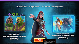
Good Tutorial
I enjoyed the tutorials, honestly. I thought they were clear, concise, and good introductions to the game. Weaver's speech bubbles were helpful, and the in-game advice was spot-on as well.
 |
| Tutorial selection |
Instead of really directing me, and teaching me where I ought to be going in game, I felt like a cat trying to catch the dot of a laser pointer.
Recommendations:
- Instead of having a down-arrow to guide at the top of the screen, consider using a left/right arrow that floats in the middle of the screen, or even the blue 'path' lines that were used in OMD 2. That way users can keep their eyes on the game more easily.
- Another thing to keep in mind: the first time the Leveling Up screen appears in the tutorial, it pulses and glows a few times. That feature made it difficult to actually read the abilities -- consider displaying this menu more subtly.
__________________________
Inconsistent 'Close'
One thing that I noticed was the inconsistent use of the Escape key to close menus. War Camps seem to be the only location that Esc can be used to close a menu -- everywhere else one must click 'Close' or X-it out.
Something that confused me momentarily was that the Close button on the War Camp is essentially displayed "[ Close ][ X ]." Upon seeing the X displayed as it was, I assumed that the key X could be used to close the menu (it didn't). I'm not sure if others would come to the same conclusion.
Recommendations:
- Keep navigation tools more consistent. I'd lean more towards allowing Esc - and maybe the X key - to close menus in locations other than the War Camps.
- I'd personally like to see more keybindings for menu navigation. At the moment, the game is very click-heavy.
__________________________
A few final notes for the devs:
- I'd like to be able to change the screen size in the main screen (when one first opens up the game). The current window size is bigger than my computer screen, and I couldn't figure out a way to shrink it so I could see all of the game's buttons.
- I wish I had known that clicking on some menu items would pop me out of the game and into a browser. It's a pet peeve of mine to suddenly be ejected from a game. I don't know if you'd like to denote that it'll open a browser, perhaps with an icon.
- When reading Hero information, I found this reference to a (string?) on each Hero stats tab: "CardDetails2_WhosSSTATS"


0 comments:
Post a Comment