The Elder Scrolls series, by Bethesda Softworks, has been in the gaming scene since 1994. In the past 22 years, the game's graphics and user interface have changed tremendously, from The Elder Scrolls Arena (1994) to The Elder Scrolls Online (2014). This post explores how the interface has changed over time and with new technology.

The first two installments in this series, The Elder Scrolls Arena and The Elder Scrolls II: Daggerfall (1996), were made for MS-DOS only, and featured similar UIs. Both Arena and Daggerfall displayed their main UI on the bottom of the screen, taking up approximately the same space. With the icons in Arena, players could draw/sheathe their weapon, steal, check their status (poisoned and such), access their spells, see their journal, rest, or view a world/local map.

Left, The Elder Scrolls Arena (1994) ; Right, The Elder Scrolls II: Daggerfall (1996)
Daggerfall made a few changes, including adding an 'interact' icon that displayed how the player could interact with the world in front of him/her (talk, observe, pick up objects, steal/unlock). Daggerfall also allowed players to access their inventory by clicking on the money bags icon in the UI or by pressing F6. This was an improvement upon Arena, in which the player could only access their items by clicking on their character's portrait and then navigating to the 'Equipment' sub-menu.

Arena's inventory included all items in a list, and Daggerfall's segmented out item types.

Daggerfall also improved upon inventory management, allowing players to more clearly see which items they had in their inventory and to separate items by type (weapons & Armor, magic items, etc.) Players could view the stat improvements of their items by equipping items and watching the numbers floating next to their characters grow or shrink. The next installment in the series, The Elder Scrolls III: Morrowind (2002), again changed the look and feel of the inventory.

Morrowind inventory window, on top of the map
While Morrowind kept the full-body demonstration of a character's equipment, it removed the floating numbers and the necessity of equipping an item to view its bonuses. Instead, a player could hover her or his mouse over a item to view its stats before deciding whether to equip it. Morrowind also kept Daggerfall's addition of separating out item types (All, Weapons, Apparel, Magic, Misc.)

Morrowind took a very different approach to how it displayed the inventory and other sets of information. Unlike its predecessors, which displayed maps, character sheets, etc. full-screen, Morrowind put all of its information sets in adjustable, windowed boxes. Players could see all of their information sets simultaneously if they so desired. Players could not, however, press a key to open only one of these windows - unless the player had toggled off certain windows, it was all or nothing.

Morrowind also changed the interaction feature significantly, shifting the action from direct (the player presses a button to set whether they're in talk or steal mode) to contextual. In the first few minutes, the player learns she or he can press Spacebar to open doors, talk to NPCs, and pick up items. Instead of requesting player input, Morrowind determined what type of interaction mode the player was in, and changed the effect of the Spacebar accordingly.

The implementation of contextual buttons in Morrowind may not have stemmed from Bethesda's innovation, but instead from necessity and a changing market. The new millennium ushered in an age of console gaming, with the release of the Playstation 2 in 2000 and the XBox in 2001. Morrowind was the first Elder Scrolls game designed for consoles - and contextual, multi-purpose buttons were necessary for console games.

One interesting part of Morrowind's UI design is the difference between the PC and console version.

PC, left; XBox, right

The designs are so different, they almost look like different games. The PC's design was simply not practical on the console, and thus a new design was made. Players could open a specific menu and then toggle between menus with the left and right triggers.

Morrowind's successor, The Elder Scrolls IV: Oblivion (2006), was clearly designed with a console-first perspective.

Oblivion Inventory Example
Oblivion condensed information sets, removing the player's ability to change window sizes and pin information to the screen. Instead, players could access information all in one panel (the "Journal") if they pressed Tab.

The Journal's design - tabs with sub-tabs - lent itself to controller navigation. Console-based players could use the left and right triggers to access the main navigation (resources, items, spells, map), and left stick to navigate the sub-tabs.

Some* PC gamers were frustrated by the change and console-focused design. In Morrowind, their information was one click away - and now they had to navigate multiple menus. Oblivion also had few keybindings for PC menu navigation. While there were technically keybindings to main Journal sections (F1 for character, F2 for items... etc.), there were no bindings available for Journal sub-sections. (*Well, at least one. I found a rant about Morrowind vs. Oblivion I found interesting.)

Oblivion made other changes to the UI as well. The game revived and adapted Arena's item list format into a sortable table and displayed important item information in columns (which previously could only be viewed by hovering the mouse over an item). Placing items in a table format better allowed players to view and compare objects in their inventory.

The Elder Scrolls V: Skyrim (2011) returned fully to lists for its inventory management, much to the chagrin of PC gamers. Skyrim's modding community came to the rescue and created SkyUI, a PC-friendly UI. SkyUI retained Oblivion's sortable table format.

Console version left, PC version right


Skyrim also had logical keybindings for PC gamers: M for map, J for Journal, I for Inventory, versus having players press the function keys. Like in the PC version of Morrowind, players could again access menus separated from the main journal. The PC version of The Elder Scrolls Online (2014) took an approach similar to the SkyUI setup and also increased the number of keybindings a player can use to access information.

In summary, The Elder Scrolls has aged well over 22 years. It has kept true to its action-adventure spirit, and has kept key elements of the HUD in each design. Every release of The Elder Scrolls has shown a player's health/mana/stamina and some navigation method (compass or mini-map) as the basic HUD. Check out how the HUD has evolved over time.

The Elder Scrolls Arena (1994), left; The Elder Scrolls II: Daggerfall (1996), right

The Elder Scrolls III: Morrowind (2002), left; The Elder Scrolls IV: Oblivion (2006), right

The Elder Scrolls V: Skyrim (2011), left; The Elder Scrolls Online (2014), right

With rumors swirling of The Elder Scrolls VI in the next few years, we'll see what kind of UI the future holds.

__________

Thanks for reading! That was a doozy of a post to write, but it was fun to go back in time and see how interfaces have changed over time, and to think about what the design decisions might've been. I was especially surprised to see the stark difference between the PC Morrowind and XBox Morrowind. I also chose not go into detail for ESO or to review Battlespire or Redguard just to keep it brief. Well, relatively brief.

Now if you excuse me, I need to go kill some dragons. I'll see you in the New Year!
And now for a break from our scheduled programming about video games, about something completely different: car accidents. Over the Thanksgiving holiday weekend, my boyfriend and I got into a car accident halfway through our 8 hour drive from Western New York. It was a minor fender bender, where our front bumper swung open like a door and our left headlight got smashed, and their car got a small dent. No one was hurt, and the other car drove away from the accident fine. We coincidentally had the accident right in front of an auto body shop, and the super-nice mechanics shuffled around their full garage to accommodate us, inspected the damage, and implemented some quick-fixes (zip-tying our bumper back on and replacing our headlight and turn signal). We then drove four more hours home in a very unhappy car.

The aftermath on our car. Not too bad.

This post is about part of the experience post-accident. Having never been in an accident before, I wasn't entirely sure what to do, besides call the state police and exchange insurance information with the other driver (although they left before I could get a cell phone number). So I did what any Millennial would do and Google "what to do after a car accident." One of the first things that comes up is call one's car insurance company. 

So I call the 'claims' number on our insurance card (somehow we hadn't received one for 2016, so this one was from 2015)... and I get a message roughly saying "hey answer this survey to enter a drawing to win a free cruise to the Bahamas!" There was no way to skip the survey from the phone options, so I took the survey. The chipper automatic voice then told me I had won, and should press 1 to accept the trip to the Bahamas. Uninterested, confused, and still shaken from the crash, I pressed 2 thinking that would be the 'no, actually bring me to the claims service.' The phone then hung up. I double checked the number on the card, so either the card's number was outdated or printed wrong, or there's actually a survey at the beginning of the insurance company's claim line. If it is actually the case that a survey precedes the claims process on this insurance company's claim line, that is horrendous usability. 

Since the claims number evidently wasn't working, or had bad usability or whatever, I called the customer service line instead. Then I had to patiently wait to listen to all the options, figure out which ones to select, and then wait for someone to answer.

I'm curious whether car insurance companies have done testing to figure out "hmm, which questions do our customers have right after getting into a car accident?" It's entirely possible that they've done such testing for their website or mobile apps - but I'm not going to download a mobile app over 4G just to see if they have a FAQ to see "what to do and what information to get after an accident." At that point, my boyfriend and I were still pretty shaken up. 

And it makes me wonder how much testing has gone into automated phone systems, where you can either state your answer or use the key pad to select a choice. How do the companies come up with the list of options? I just wish there was a line on my insurance card that said "this is the line to call directly after calling the state police/an accident." When I'm upset, I have less cognitive processing power to figure out what "claims" means and what information I will be expected to provide.

Working in the finance industry, the most I've come into contact with designing for human sadness is determining how to delicately design for customers who have recently lost a loved one, and now must transfer assets. Grief is an entirely different emotion than shock, and I'm curious how designers account for creating systems and designs that are easy enough to understand and process even when a user is overwhelmed.

I'm sure there's been lots of design of emergency pamphlets (like in airplanes) and instructions for medical equipment (talking defibrillators) - but what about for situations that are further away from the institutions (in one's personal car - there's no safety officials around to guide you)?

/sigh

Anyways, I think that's the end of my rant for now. I'll resume my regularly scheduled programming next month with more video game usability reviews. If you know any games I should review, please let me know!
From single-key side-scrollers like Canabalt to flight simulators, video games are complex. As such, over time, game designers have created ways to teach users how to control and play their games. Some of these methods require extensive effort on the player's part, like reading a manual, wiki, or having to Google answers undefined keywords. 

Boo. Hiss. (I dislike reading manuals for games)

Other games have tutorials so unobtrusive and integrated that they hardly feel like tutorials at all. Tutorials come in all shapes and sizes and range from being short and subtle to mind-numbingly long and ham-handed. Unless you're a very selective or lucky gamer, you've probably run into at least one frustrating tutorial.

To me, it seems that many players have developed an aversion to tutorials. And some developers, seeing this trend, have either cut their tutorials out completely or skipped steps to shorten the tutorial length. As a usability-specialist, this trend concerns me.

In this blog post, I'll give examples of game tutorials that I found to be particularly good or bad, and explain how learn-ability and usability go hand-in-hand.

Tutorials & Education

In my view, the main goal of a tutorial is to answer these questions:
  1. What should I be doing?
  2. How do I do it?
  3. Why should I do it?
  4. When should I do it?
As others have discussed before me, these questions ought to be answered for each important game element, and the tutorial structured in such a way that concepts build upon each other and information is presented as the player needs it. There are a variety of methods that game designers can use to teach their game, which I won't cover here.

A game that does not answer all of those four questions, or teach important concepts progressively, can be incredibly difficult to learn, let alone master. One game that I've played recently that does not make learning easy is Stellaris.

You're On Your Own, Kid
Stellaris, by Paradox Interactive, is a 4X strategy game which revolves around space exploration, warfare, and diplomacy. As the architect of a grand space empire, there's a lot to learn - how to build ships, research technologies, settle new planets, manage solar systems, and more. It's a shame that Stellaris only teaches you a fraction of what you need to know. 


Although Stellaris has a small tutorial-bot that acts as an adviser in the early game, the tutorial content isn't even close to comprehensive enough to fully learn the game. The main issues with Stellaris' tutorial content are that it doesn't teach information progressively and does not answer the four main questions: what should I be doing, how do I do it, why should I do it, and when should I do it.

Take for example the first tutorial box that Stellaris provides:

Maybe I updated my keybindings, but F5 doesn't show the Situation Log - F3 does.

Once I pressed F5, I saw the following screen (which is NOT the Situation Log! But I didn't know that at the time). And since I wasn't directed to the Situation Log, the bot's next instructions about planets and sectors made no sense to me.


The first time I encountered this disconnect, I remember being very confused: had I clicked the wrong button? Is this the mission list? Because the instruction went to the incorrect place, the tutorial flow was presented to me in the wrong order, disrupting my learning. But let's say that the tutorial had currently instructed me to press F3 instead of F5. I would've seen this instead.


If the player successfully navigates to the Situation Log, s/he will learn the What, How, and some of the Why for Science Ships, but Stellaris doesn't give much direction from there. The tutorial tells the player s/he can select the vessel either by clicking on the ship itself or selecting it in the Outliner (which isn't helpful information at this time, because while the Tutorial Bot is active, the Outliner panel is automatically hidden.) If a player selects a Science Ship as the tutorial suggests, s/he will learn a little more about what Science Ships do... but after that, direct guidance is rare (I believe there's one much later with sectors).

The only way a player learns about the game after the Science Ship lesson is to explore what messages come up when s/he clicks on a unit or a menu. And while, sure, messages like the following Leaders tip are informative, they aren't helpful or educational.


The above tip answers none of the vital tutorial questions: what should I be doing, how do I do it, why should I do it, and when should I do it. (If you're curious, the answers are 1) Assigning leaders to various posts to make your empire more efficient. Each leader gives some kind of bonus or discount; 2)  It makes your society more efficient and has other various bonuses; 3) use this panel and click the 'Recruit' button; 4) Whenever you need a bonus and can spare the Influence to get a Leader.) 

By not encouraging players to click on menus in a certain order and experience the tutorial in a set and organized flow, the tutorial makes the learning experience jarring and incomplete. This is deeply frustrating, because the player may be hours into a game when s/he learns about the ship builder and why it's important and only after her/his fleets have been blasted to smithereens by enemy fleets (or in my case, I didn't realize that I needed a mix of large and small ships in a fleet, I thought I could just have beastly battleships. Oh well.)

Perhaps in an effort to not make players to feel hand-held or babysat, Paradox decided to allow players to move through tutorial tips in a free-form manner - which is not conducive to progressive learning. Stellaris' tutorial flow is like a poorly-structured math class -- it teaches multiplication before addition. Sure, you're still learning basic math, but since addition is the foundation of multiplication, the student can't actually learn what s/he needs to be successful in mathematics.

Stellaris is a fun game, once you get the hang of it, but Paradox Interactive doesn't make the game easy to learn. It's 'Full Tutorial' which I've described here isn't a true tutorial, in my mind - it's a series of fragmented tool tips. And it doesn't work for such a complicated game.


Here, Let Me Help You

Conversely, there's Offworld Trading Company (can you tell I like space-themed games?) which has a very good set of tutorials for players. They separate the tutorials into two sections: Learn to Play and Practice Games.


The Learn to Play games teach concepts progressively, with each tutorial building upon the basics established in Business Building Seminar. The first tutorial teaches you the backbone of building a business: gathering resources for production. It starts off with describing what the cubes represent and look like, and then steadily building upon that knowledge.

One cool thing that this tutorial does is that the 'continue' buttons are important questions that players might not know to ask, but will need answered. That's a clever way of teaching.
After the Tutorial Bot teaches the player what the cubes are, it gives the player an objective of building mines and reveals and illuminates unlocked buildings. As the tutorial progresses, the left bar populates more as the player learns what each building looks like, needs to function, and does for the player.


Although some player may balk at the concept of such a structured tutorial, I love it. The game explain all the information the player needs to know in the ideal order, explaining the what, how, why, and when in an easy-to-learn way. If you're a developer and want to experience a well-done tutorial, I recommend picking up Offworld Trading Company. It's a fun game and a good example.

Deconstructing Rules to Chunks

Now, I'm certainly no expert in learning, but one thing for game designers to consider in their tutorials (because really, you need something, even if it's just one line of text saying 'press X to jump) is how they should structure their lesson. Think of it again as that wonky math-class: you want to teach addition before multiplication.

Before you build a tutorial, you need to be able to answer this question: what game element is the primary foundation of my game? You can think of it like a tech tree: what must the player learn to be able to win the game?

Example of a tech tree (techincally civics, but close enough) from Civ VI

The creators of Offworld Trading Company determined that the most important element in their game is identifying resources. Once the player can identify resources, s/he can learn how to build mines to collect those resources. Once the player knows how to build mines, s/he can learn how to generate electricity and other resources to keep those mining stations running. And so forth.

When building your tutorial, it may be helpful to think of it in that way - if you were to make a tech tree where each element is something the player has to learn, what's the order and structure of the tech tree? It maybe a difficult task to undertake, but a helpful one.

Final Thoughts

All in all, it's tricky to make a tutorial that pleases everyone, as every individual learns differently. But it's very important that you try. As you construct your tutorial, ask feedback from family and friends along the way about whether the structure makes sense, and if they have questions. It'll go a long way.

_________

Sorry for the long wait in between posts! I've been super busy recently, and it's really only been possible to write once a month. Plus, this specific blog post took me two Sundays to write since I kept getting interrupted. Ah, well. Is life. Thanks for reading!


We Happy Few, by Compulsion Games, is a rouge-like, survival-horror game set in a retro-futuristic and dystopian world. The creators cite Brazil (1985) and "medication nation" culture, where every conceivable problem can be solved with a pill, as sources of inspiration.

The alpha is well-polished and enjoyable, with room for improvement in how it explains saving.

Saving Options
One of the first things I do in every game is edit the settings (usually the mouse sensitivity is way too high for my tastes).


Here, I decreased my mouse sensitivity, and looked for the 'Accept' button like I had seen in the initial game setup (when it asked me whether I wanted permadeath on). I couldn't find one, so I pressed 'Enter.' When I pressed Enter, the Mouse Smoothing toggle switched. So I knew it wasn't that. Beyond pressing Enter, I couldn't determine how to 'Accept,' so I pressed 'Back.' No luck there, so I pressed 'Resume.'

After a few rounds of settings changes, and trying to figure out how or if the game was indicating settings saves, I determined that the way WHF displays both settings saves and in-game progress saves is by flashing an icon on the screen, like below.


Although I had seen the icon appear earlier, and have been trained that 'blinking/animated icon = progress saving indicator,' I did not, and do not, associate a blinking saving icon with my settings changes. To me, a blinking icon means that the game thinks it's time to save my progress because I've reached some kind of checkpoint, or I just pressed a save keybinding. A blinking icon is a subtle message that says, "Hey, you've made some progress, good job you!" I do not associate saving settings with this icon because saving settings does not indicate progress, it indicates preference.

Recommendations

  • It's pretty clear that the menu hasn't really been designed yet (which makes sense since it's just an alpha), but I very strongly recommend that one of the first changes you make for the menu is adding some kind of button that says 'Accept.' Otherwise changing one's settings is a frustrating experience.
  • Once you do add an Accept, consider allowing 'Enter' to be a way to accept a change.
  • A question - if I go into a menu, make some changes, and then press Esc a few times to exit the menus, did my settings save successfully? I would think that they wouldn't, but I'm not sure (because there's no Accept button).

Comments and Questions

For the most part (the savings thing really being the issue), We Happy Few is fine from a usability standpoint (the benefit of having a User Researcher on staff. Hi, Morgan!). There are a few things that were big enough to catch my attention, but too small to write an entire section about. I'll compile those here.

Keybindings
One of my first thoughts about the keybindings is "why do they have two default bindings for the crouch action?" For non-gamers, the Control key is often used in FPS for the crouch action -- and that worked in WHF. But in the very beginning, the player is encouraged to use 'C' to crouch. It's OK to have two keys do essentially the same thing (I did notice that Control is a temporary crouch, while it's held down, vs. 'C' is until it's pressed again), but it's a little strange to have duplication there.

The other thing about using 'C' to crouch is that 'C' is often used in other games to look at one's Character page (which on the image below would be the first ( ? ) circular tab). Although the game encourages the player to press Tab to see the in-game menu, most typical bindings for this menu work. ('I' for inventory, 'M' for map, 'J' for journal. I was a bit surprised by 'B' for crafting, but I'm not sure what else it would've been.) Since those bread-and-butter bindings work, I'm surprised that 'C' is used for something other than looking at one's character.


I'm also a bit torn about whether y'all should have some kind of hover text (or whatever) over the circular tabs to indicate what the shortcuts are for those pages- the design is currently very clean, but if We Happy Few is a player's first excursion into the gaming world, she or he may not know those common keybindings.

Equipping Items

The first time I opened the inventory, I had absolutely no clue how to equip an item or get it to be in my quick-equip section. This might be due to the location of the explanation text - it's currently hidden in the corner, and unless your mouse is hovering over something, you don't see this explanation text. Honestly, I was confused enough about how to quick-equip that I attempted to click and drag something from my inventory to that box. Because I was confused, the item iconography confused me -- I thought that the gear icon on the 'Metal Bits' hover explanation could have been a settings gear that would let me quick equip or change some kind of setting. But of course, as I tried to move my mouse over, it would disappear, because it's not a settings gear. I'd honestly recommend changing that gear icon to something else - it's commonly used as a settings icon, and even if that's not how it works here, it can be interpreted that way.


Location of Saving Indicator

It's weird that the flashing saving icon appears in the same location as the Date & Time - I didn't see it immediately in part because I think I didn't expect to see it in the same location as Date & Time. I'm also used to seeing it in the bottom-right, but maybe that's just what I'm used to.

Water Pumps

When one is at a water pump, up to two messages can appear: 'Hold [ E ] to drink from Water Pump' or Hold [ V ] to Fill Container from Water Pump.


The first time I encountered a Water Pump, I was a little confused, because I had forgotten that I had picked up a canteen, and because it said 'Hold [V] to Fill Container' and not 'Hold [V] to Fill Canteen' I wasn't sure why I was seeing this message. And at first when I pressed it, and no container appeared in my hands, I thought I had received the message in error (until I heard the sound effect of a container filling).

One comment/critique I have here is that those sentences are quite verbose. The Flame in the Flood handles this well - when the player has a Jar and is at a Water Pump, she or he sees the prompt "[ E ] Fill Jar", and then the player holds down E until the little circular progress icon around the E shows that the Jar has finished filling. If the player does not have a Jar, the prompt is "[ E ] Drink." (I'm pretty sure. I'm not near a water pump right now in the game, so I can't confirm.) I feel like that's a more succinct and elegant solution.

The Flame in the Flood also uses the 'Hold to Interact' method - but only points out that the player needs to hold down [ E ] in the first few minutes. After that, there's just a small progress indicator around the [ E ] button, rather than saying Hold every time. That's also a more elegant solution.

Final Thoughts

Even though it's only in its alpha state right now, We Happy Few is a lot of fun and I highly recommend the game. It's wonderfully creepy and well-crafted.

Thanks for reading!


League of Legends, by Riot games, is a third-person MOBA using three games modes: Summoner's Rift, Twisted Treeline, and Howling Abyss. There are two tutorials. After the first tutorial, players can choose to do another tutorial-like training. If they accept, players select one of three “champions” who each have unique abilities. Teams consist of 5 players with the goal of destroying the opposing team's nexus.

With over 67 million players every month, it is a top game for any MOBA player. With such high playing traffic, it is important to assess the usability of the game’s tutorial. Although I have some previous experience with MOBAs (Heroes of the Storm), the steep learning curve of League of Legends was slightly overwhelming.

After completing the tutorial for the game, I was brought to another tutorial level as an introduction to “Summoner's Rift”. Unlike the first tutorial, which teaches you the basic mechanics of the game, the second tutorial has you play with 4 other bots against the AI.

The primary usability problems with the tutorials involves the character loadout screen and item-buying mechanism. The first loadout screen has many voice/text introductions to what everything on the screen does. Some of the information is easily forgotten as it is not yet applicable, such as the “Runes” and “Masteries” tab.


Character Loadout Screen 


After accepting the battle training tutorial, I was brought to the above screen. By the time I finished selecting my character and waiting to play, there had been 17 information boxes accompanied by voice instructions.

This felt slightly overwhelming, although it did help that I had to select “Continue” on most boxed in order to progress, so I could take in most of the information at my own pace. By the time I was ready to play, I felt only slightly less confused than when I began.

The issue of the vague information about such items as “Runes” and “Masteries” combined with trying to figure out the previous information regarding selecting spells made it overwhelming. This is because selecting a spell prompts the instructions to move forward before you can select two spells.

Although there are only two spells available for the first game, there is no intuitive confirmation that tells the player they have selected the spells. I had been waiting for something to tell me I had selected the spell I clicked on. Because of this, I was stuck trying to ensure that I had selected two spells and ignoring the information that the tutorial had moved on to. The images below demonstrate this chain of action.

Spell Explanation
Select Spell
 Selecting first spell
Immediately after selecting first spell

Rather than a notification indicating the spell you had selected, the number “1” is shown on the first spell icon that is selected. After this selection is made, the number “2” is shown on whatever spell icon you select subsequently. This is slightly confusing since the spells selected do not give confirmation nor are they highlighted.

Recommendations:
     Continue to the information boxed to use “Continue” button in order to allow the individual progression throughout the tutorial. (Moderate)
     Highlight the spells that were selected or include some sort of confirmation.(Moderate)
     When instructing the player to select items (such as spells), wait for the player to select both spells before moving on to the next instructional piece. (Severe)

Purchasing items

The biggest issue is the lack of information on improving your champion through purchasing items, especially when players buy items in real-time. After completing the initial tutorial and moving into the battle training phase, I had minimal knowledge of what items to purchase.

After playing the battle training for several minutes, I noticed I had less kills than the other bots I was playing with. Using the tab button to look at my kills/deaths/assassins, I noticed that the other team members had more items than I had.

After going back to the base to purchase more items, I was not sure which items to purchase. My ignorance, combined with pressure of purchasing items in real-time exacerbated the stress of quickly selecting an item.

I thought the most reasonable thing to do would be to start at the top and select items from each line moving downward since each line below the last had one more item, giving it the look of progression. Notice the arrows between items. I found these easy to miss partly because I was eagerly looking for any way to categorize items and partly due to wanting to select an item as quickly as possible so I could get back to the action. It was also easy to gloss over the text located above each row of item icons that explain what purchasing these items will help upgrade.

Recommendations:
     Fit somewhere into the first tutorial that items affect each hero differently and certain types of heros may want to focus on certain items over others. (Minor)
     Have items displayed in a way that is categorized so the player can easily tell which category an item belongs to, such as highlighting the text above each item row. Right now it blends in with the dark background. (Moderate)

Final Thoughts:

Overall, the league of Legends tutorial does a decent job at introducing new players to the game. It would be ideal for players to have more of a chance to further their skill level and understanding of the game prior to jumping in with other players.

The current setup between the formal tutorial and the PVP option helps players in this way: by forcing players to work up to level 3 before being allowed to play PVP. Players are allowed to play with other teammates against AI’s until they level up, giving them more of a chance to familiarize themselves with the game. As a MOBA player, I’m excited to keep playing and learn more about the game!


Quern - Undying Thoughts is a first-person puzzle game in which the player explores the past and present of a legendary island. Released for Kickstarter supporters who backed at the beta level, the game already has a healthy Facebook group for Quern BETA testers where players can ask for puzzle hints or clarifications about the game.

As with most games I've tested in beta, Quern has clean gameplay, with less focus placed on menu navigation and clarification. This post will mostly cover clarification, while avoiding spoilers (at least I'll try).

Settings and Setup

On the main loading screen and in-game, the player has access to a Settings screen. In it, she or he can toggle between four options: Gameplay, Graphics, Audio, and Controls.

Gameplay Tab in Quern's Settings

There are a few basic problems with this menu and default setup.

Font Treatments

First, I'd like to commend Quern for using appropriately-sized fonts -- in many of my reviews, I've covered how a game uses too-small font. Quern doesn't have this problem, for which I am thankful. My eyes thank you, Zadbox Entertainment. But, beyond that, there is room for font improvement. There are a few problems with the font faces and treatments that Quern uses.

One place where the font treatment can be improved is in its selectable headings, as shown in the above picture. Depending on one's screen brightness and contrast, or whether a player has a visual impairment, it may be difficult to determine which tab (Gameplay, Graphics, etc.) is selected, because the font difference between an active tab and an inactive tab is so slight. In interface design, it's a good practice to duplicate visual treatments that indicate whether something is selected. An example of duplicating selection visuals is actually present on the screen - on the far-left menu, the Settings selection has a thin line that Ts out on the Settings main screen. That T helps illustrate that Settings is selected.

Another place that could use improvement is the font-face that Quern uses. Depending on the quality and resolution of one's screen, serif fonts can be more difficult to read. There's inconclusive research about the legibility of sans-serif vs. serif font on a screen, but it's the current practice to use sans-serifs font in the event that someone has a bad monitor.

 Recommendations:

  • Medium Priority: Instead of using color to denote whether a header is selected, consider using font type (bolding a font that is selected) and implementing another visual indicator of selection.
  • Low Priority: Consider changing your menu font to a sans-serif font. This isn't necessary - as users won't be spending a ton of time in menus - but it could be a low-effort fix.

Applying Changes

Another confusing element in the settings is figuring out how to apply changes. On the 'Settings' tab, there's text at the bottom that says 'Apply Changes,' but on the Graphics tab, there's a button that says 'Apply Changes.' I had trouble finding the Apply Changes on Settings, but found it easily on Graphics.


Recommendation 
Keep consistent with how you allow users to apply their changes - and I'd recommend going with the button approach. In my experience testing designs, a button is generally a better call to action than just text (with 'better' meaning people find the buttons more quickly and accurately than just a link). You may also want some kind of notification that reads "settings applied" after the player presses 'Apply Changes.' After pressing 'Apply Changes' on the Settings tab, I wasn't sure if it worked or any of the changes had been enabled. This seems like a low-priority, but easy fix.

Motion-Sickness Enabled

As I've written about before in this blog, I'm prone to video game motion sickness. So far, I've only been able to play Quern in fits and spurts due to feeling queasy, even after adjusting all of the settings (screen brightness, disabling head bob, and turning off motion blur).

Recommendation
One recommendation I have for the developers is to either have the game default to having head-bob off and motion blur very low, or have a checkable button that changes the settings to prevent motion-sickness for those who are prone. Because I suffer from motion-sickness, and it's a truly bad experience, I'd put this as a medium priority issue. Many players may not suffer from game-induced motion-sickness, but it's a real fun-killer for those who do.

Interactivity

Quern does a decent job of teaching the player how and when she or he can interact with the world, but there is room for improvement. 

Icon Transparency

At the beginning of the game, Quern clearly explains what the player can do in the environment. As shown below, in the first minute, the player sees floating text that tells the player what she or he can do in the world (namely, click to read the letter).


But without the floating text, it would be more difficult to determine what to click on or what was interactive. Part of the reason for this is the transparency of the cursor. If you look closely on the above picture, you may see a small circle with an eye on it. That cursor indicates that the player can read something. If you're unable to see the cursor in the above picture, here it is blown-up, next to the icon that indicates nothing is interactive. 

Inactive on left, active on right.

Recommendation
Since showing floating white text every time something can be picked up or read would be unimmersive, consider making the cursor (eye icon, or hand icon, or whatever other icons there are) more opaque to help the player more easily identify when she or he can interact with an item. I'd recommend this change as low-priority because it's not a game-breaker, but it would definitely improve quality of life.

Inventory Manipulation

Another way Quern can improve interaction clarity is to more clearly explain that a player can manipulate the items in his or her inventory. During my first pass at the game, I either didn't process the entire sentence at the bottom of the screen - "Click to rotate or interact with items" - or interpreted "interact" as just another word for rotating (rotating an item technically is interacting with it).


As such, when I came to the first puzzle door, I had no idea how to complete the puzzle and had to go to the Quern Facebook group to ask for help. Having to ask for help on something so simple made me feel like a bad/stupid player - but as a user researcher, I know this feeling is a result of confusing design, not my ability. 

Recommendation
I'd recommend implementing some visual indication (besides text) that the player can manipulate as a high-priority issue - I was frustrated enough with the game that I had to quit it before seeking help, and it left a bad taste in my mouth. My recommendation here is to implement something similar to Tomb Raider's (2013) inventory management, which more clearly displays that the user can interact with the item by bolding a left-aligning the text to more clearly emphasize it. 

https://archaeologyoftombraider.files.wordpress.com/2013/08/2013-04-13_00101.jpg
Artifact viewer from Tomb Raider (2013)


Another way that Quern can make the interactivity of items more clear is to enable the cursor to hand-icon in the inventory, like below, when the player's mouse is over something they can manipulate (like rotating elements of an item). 


That way, it's more clear that the player can manipulate the item. Of course, one consideration is that the hand icon has already been associated with the 'pick up' action - but I don't think it's too much of a stretch to also make the icon indicative of being able to manipulate an item. 

Lack of Microinteractions

Another element of Quern that was confusing was the lack of microinteractions when a player could not interact with the environment. For example, at one point in the game, the player can find a lock-box. When the player hovers the mouse over the box, the icon changes to the gear icon, which has been established to be one of the 'you can interact with this if you have the right tool/item' cursors.


Because there's an icon-laden cursor, and I've already associated icon-laden cursors with 'click here, something happens,' it's an unexpected and surprisingly frustrating experience for nothing to happen when I click on it. 

Recommendation
Though it's clear that I'm missing the right piece to open the box, I wish there were some kind of auditory indication that I can't currently open the box (like a rattling box noise, a locked sound, I don't know). I'd recommend implementing some kind of indicator as a low-priority issue - I can get used to nothing happen, but it's not a satisfying experience. I'd recommend you add an auditory of visual indicator before a wider release.


Browsing Letters

In Quern, the player must rely on letters left by an archaeologist to solve the puzzles. Depending on the puzzle, the player may need to switch between two letters to solve a puzzle. Currently, the only way to switch between letters is to open the letters menu (L), click 'Browse Letters', and then select a different letter from a queue on the bottom.


This is a rather clunky implementation if the player needs to switch between looking at letters and then interacting with the puzzle.

Recommendation
Consider implementing some other way for the player to switch letters besides clicking 'browse letters.' For example, you could do something like this instead, where the letters are numbered in a carousel.

Somewhat like this, but better. I'm not a designer.

This way, players could look at and switch letters more easily. To switch which letter is in the center, the player could either press the letter's number (so if I press 5 on my keyboard, 5 would be centered on my screen) or click on that letter to center it. When a player gets a new letter, it becomes the one in the center, with the older letters to the left. There are probably easier methods to implement, but this is one way to make switching and seeing letters easier. I'd say changing this is a low to medium priority issue. I haven't gotten far enough in the game to gauge how often the player needs to switch between letters, but in the first half hour, it was enough to be an issue. 

Final Thoughts

I feel like Quern is going to be a great puzzle game, but until I get the motion-sickness settings right for me, I'm not able to have fun. Which is super disappointing. But when it comes out for a wider beta, I bet a lot of folks will enjoy Quern. With a few usability fixes, this is going to be an even better game.

(Oh, one final-final thought, remember to remind players to walk with WASD! New players don't always know that!)

____

Hi, folks! Thanks for your patience. I know it's been a while since I wrote. July and August were and are busy months, with lots of work at work (I'm covering for someone who's on maternity leave) and a family wedding in early August. I think for the time-being, I can commit to one blog post a month, two if possible (but currently not probable, until work slows down a bit). Anyways. I'm thinking I'll review Stellaris at some point, although I've been playing it so much that the usability issues aren't as apparent. Maybe I'll have the self-control to put it down. Maybe.

Again, thanks for reading! Let me know if you have any comments in the comments, or on Twitter @keshiekay.


Pokémon Go has arguably captured the hearts and minds of Millennials, harkening back to the mid-90s when the Pokémon craze first hit. Free on iOS and Android, the game encourages players to wander their towns or explore new terrain (such as the areas near bodies of water) to find different types of pokémon.

Though this game has broken records as the highest-grossing free to play game on iOS, and has between 1 - 5 million downloads on the Google Play app store, there are still many issues (usability and otherwise) that Pokémon Go displays. Since many news sources have covered the game's widespread server outages, account troubles, and other nasty bugs, I'll stick to the usability issues.

The game's most prevalent and painful usability issue is that beyond showing the player that they need to swipe a pokéball to catch a pokémon, and can only interact with a gym once they're level 5, Pokémon Go does not spend the effort to teach players the game. Which is surprising, because there isn't too much to the game.

Post-onboarding (entering your age, speaking with Professor Willow about where pokémon are found, and choosing your avatar), there are seven elements of the game: finding pokémon, acquiring pokémon, improving pokémon, acquiring items, using items, interacting with gyms, and shopping. Of these elements, shopping within the micro-transaction store is the easiest to intuit.


Gotta Catch 'Em All


Finding, catching, hatching, and powering up or evolving pokémon comprises the majority of the game. Of these, finding and catching are the most confusing.

Finding
The primary method of acquiring pokémon is walking around your area until you run into a pokémon. Though it's never explained, players have intuited that rustling leaves on the ground mean that a pokémon might appear in that location. The other means of finding pokémon is by using the tracker in the lower right hand corner in the screen, which displays which three pokémon are the closest to your location.
Lower tracking bar

The pokémon appear in this bar are between 50 to 200 ft. from you, with each footprint equating to ~50 ft.

Quarry-specific tracker
If the player is interested in tracking a specific pokémon, she or he can tap on the tracking bar (which occasionally flashes, potentially to draw initial attention to its presence), and then tap on one of the pokémon to track that displayed in the first trailer) is that tracking a pokémon becomes a confusing game of hot and cold, where you don't see whether you're going in the right direction until you've walked ~five car lengths. While that means you're walking more, which is both healthy and productive, it can be frustrating because the pokémon you were hunting may have run away while you were going in the wrong direction. In trying to come up with more efficient ways to estimate distance to one's quarry, players have come up with various theories (proven or disproven) to potentially make the hunt easier. While consensus is that one can track distance to a pokémon by watching pokémon re-order on the tracker modal, there seems to be a desire for a more straightforward way to track closeness.

My primary recommendation here is to consider making the tracker bar flash when the player is going in the correct direction of their quarry - or at least explain why it flashes periodically.

Catching
A spearow joined me at Starbucks.

Once the player has found a pokémon, they then have the option to catch it. In the brief onboarding tutorial, the player is taught that they need to tap on a pokémon on the map to gain the option to catch it.

While the player is taught that they need to flick the pokéball within the white circle to catch it, the game does not explain the purpose and significance of the inner circle. According to Niantic's support page for the game, the redder the inner circle is, the more difficult it is to catch, and the smaller the circle is, the easier the pokémon is to catch. Since this isn't explained in the game, I've read multiple articles about how to play the game with conflicting answers (but I'll trust Niantic's, seeing as they made the game).

The other elements about catching that aren't explained are using items and how to get catch bonuses. For example, the player can get "nice throw!" or "curveball" catch bonuses -- but how one gets these is not explained.

Of all parts of the game, I would say that the pokémon catching mini-game of tossing the pokéball is the most fun -- I just wish it had been explained better.

Recommendations

  • Explain in an in-game tutorial that the player shoot shoot for a smaller circle for better chances.
  • Explain how a player can get the 'nice throw' or 'curveball' bonuses - if there's a specific goal I should be meeting to do that, I'll start altering how I toss.


Autocorrect names my catches.
Hatching

Another way to gain pokémon is to hatch them. One of the items that players can acquire during their travels are eggs -- but while the game clearly notes when one has acquired an egg, it's not immediately clear how one incubates eggs. Over the last three days, when I've run into other new players, some asked how to incubate eggs.

To reach acquired eggs, the player needs to go to their list of pokémon, and then either tap on the 'EGGS' tab or swipe (which I discovered accidentally). Accessing this area is not clear or quick.

Once a player has found the egg section and has acquired at least one egg, she or her has the option to incubate the egg to hatch a random pokémon. Eggs are associated with a specific distance -- the longer the distance (2 km, 5 km, 10 km), the more rare the pokémon.


The player starts out with one incubator with unlimited uses, otherwise he or she can buy additional incubators from the store with three uses. An important thing to note -- that I didn't realize and I thought there was a bug -- is that when incubators are in use, they are greyed out and you are unable to select them. So if you want to be incubating all of your eggs simultaneously, you need to buy a steady stream of incubators from the store. (Which for me is dangerous, because I'm what the game industry calls a whale -- I get addicted to games and spend a lot of money on F2P games).

Recommendations

  • Consider allowing players to tap on any egg icons when they're acquired (and appear in the right side of the screen), which will then take them to the egg menu.
  • Instead of greying out the incubators, consider saying 'in use' instead.


Evolving & Powering Up

Information for Exeggcute
After a player has acquired a pokémon, they are brought to a screen like the one of the left, which shows the pokémon's information, including its health, type, and where it was caught. From this page, the player may also have the option to power up, evolve, or transfer their pokémon to gain more candies.

Overall, I'd argue that this screen is mostly clear: showing a pencil next to a name is an oft-used design treatment to show an editable field, and throughout the app, interactable buttons are a green color, and uninteractable buttons are greyed out. Because they do this consistently throughout the app, including in account creation, it's pretty clear when the player has the resources to power up or evolve their pokémon.

The one main place I see room for improvement on this screen is the location of the Transfer button. The transfer button is the last item on this page, and even if one scrolls down to the bottom immediately to transfer, they're forced to scroll a little bit more after a map lazy loads and moves the location of the transfer button. Since transferring a pokémon is actually a significant portion of the game, I'm surprised that it comes after a map that shows where you caught the pokémon.

Recommendations

  • Consider switching the locations of the map and transfer button -- since transferring is a really integral part of the game, and looking at a map isn't the locations ought to be reorganized.
  • Consider allowing players to start another power-up from the black screen where it shows the powered-up pokémon's new stats. That way, the player doesn't have to tap back and forth between screens.


Gaining and Using Items

Another core part of the game is acquiring and using items. After the player has been taught how to catch a pokémon, she or he is encouraged to go find a pokéstop, where the player can gain items. Professor Willow shows the player what a pokéstop icon looks like, but then leaves him or her to figure out how to use a pokéstop.

Here's a quote from a friend of mine, another new player:

"Maybe I missed the instructions somewhere, but the first time I went to a pokestop, I couldn't figure out how to get items from it. It was very disappointing and I left empty-handed. :( "
If the player taps on either Menu > Settings > Quick Start or Menu > Tips, she or he will be shown a brief tutorial that explains how to interact with a pokéstop. But if the player doesn't, then it's not clear how to gain items from a stop.

Once a player has gained items, she or he has the option through the menu to access the items screen. The interactions are relatively clear through this not clear is using items.

Say one of your pokémon has taken damage. You may tap on your collection of potions, and are then shown an array of pokémon who are not at full health. For a fairly long time, I thought the way to heal a pokémon was to repeatedly tap on the potion icon, then tap on the pokémon that needed healing. It was not clear to me that because I'm in the potion screen, that I don't need to tap on the potion icon to use it.

Recommendations

  • Consider changing how the tutorial is presented -- when a player reaches a pokéstop for the first time, show how she or he can interact with the pokéstop.
  • Clearly explain how using items work -- once you figure it out, it's okay, but it's not immediately clear what to do.
  • Allow players to swipe left to right or right to left on a pokéstop image - it doesn't really make sense why one needs to swipe a specific way.
  • Also, it's not entirely clear how to use an incense - to activate it, on needs to tap on the incense - tapping anywhere else gets out of the screen.
  • Why is it that one can discard items during a catching mini-game? We're not able to pick any up (right now, at least), so it doesn't make sense that we can discard. My sister accidentally discarded some of her berries this way.


Interacting with Gyms


Buggy gym battle :-(
Another fundamental part of the game is defending and attacking gyms. In the quick start tutorial (which, again, is hidden) you learn what the different icons are on the gym and how to dodge attacks, but you're never taught how to attack.

After reading through a few tutorials, I learned that in order to attack, one must tap on an enemy pokémon repeatedly, and that attacking builds up your own pokémon's ability to use a special attack. In order to use a special attack, one presses and holds to unleash the attack.

Other unexplained gym elements are what does the 'person icon' (below the CP 523 in the adjacent image) mean? Does that mean two other players were actively defending that gym when I was there? Did that mean two other players had placed pokémon on that gym?

My recommendation is that Niantic create a detailed and timely explanation of how one interacts with gyms. Once a player chooses a team at a gym, she or he should be introduced to how to fight (attack, special attack, dodge) and raise the prestige of their color's gym. Currently, it's a baffling experience. And please, please fix that 1 HP bug! It's rage-quit levels of frustrating.


Shopping


Overall, using Pokémon Go's shop is pretty clear. It's easy to read what the options are in the store, to see how much they cost, and confirm that you really want to purchase something so that a player doesn't accidentally make purchases they didn't intend.

Really the only thing that isn't crystal clear is the shield in the upper right hand corner of the store. After digging around, I learned that shield is a way to gain coins for the store, and the amount one acquires is based off of how many gyms the player has a pokémon defending. One can get this coin bonus once a day.

My recommendation for the shop is to explain this feature up front, the first time a player goes to the shop. I believe it's clear that there's a timer after the player taps on the icon, but what the icon means should be explained before a player feels the urge to purchase coins.


Other Usability Concerns


Before writing this post, I crowd-sourced other usability concerns and questions from my friends. Here are a few.

"I'd also complain about the way you log in. I've got 2-step authentication on my Google account, and that means I need to enter a code every time I want to log in. The app doesn't seem to save your credentials the way any other application would, so it's a pain to enter in my email address, password and code each time I open it."
"There's a radar-like pulse coming from your character, which you'd think would work like radar -- that is to say, giving you pings and little clues as to where the Pokémon are. So far, though, the rustling leaves are the only way to tell where the Pokémon are likely to be, and there's no guarantee that being in that area will lead to an encounter. There are also sparkles and glowing specks of dust rising and falling on the map, but so far I haven't seen that visual effect have any relevance."

"I'm also annoyed that you can't change your clothes after you choose team color, but they're clearly options for team colors but you don't know anything at the point when you choose clothes." 

"What does AR mean (in catching) top right? I don't want to click it because I'm focused on not losing the pokemon!" (explained) "Confusing. Isn't that what the battery saver option is for? And it doesn't save your settings so I have to click battery saver every time when I log in, and turn off the music."


--------------

Final Thoughts

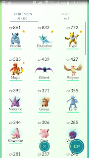
All in all, I'm enjoying Pokémon Go. As of writing this, I have 57 pokémon and am at level 13. I'm hooked. But just because I'm hooked doesn't make it a fantastic game. The game has great potential, but at the moment it's almost too frustrating to play. I know multiple people who downloaded the game, played it some, and then said that they're uninstalling until some of the more egregious bugs are fixed. For those who want a reason to go outside and get exercise, and meet new people, consider playing, but you may want to wait a bit for the issues to be worked out.