
Three Days, by Gore Pixel Games, is a survival game in which the player has 72 hours to escape an island contaminated by deadly mutation agent called SCP. Collect resources and craft items to build a boat to flee before the island is bombed to prevent the spread of SCP to the mainland.
As an Early Access game, there's a lot of work to be done in Three Days. The game's primary problem is that its tutorial is not an effective teaching tool, and leaves the player stranded and confused.
Tutorial Tells, Not Shows

When you start a game, you're first shown a tutorial. It goes through the basics of the game -- eat enough food, drink enough water, and keep yourself at a good temperature. The better your mood, the more quickly you move. And as you level up, you can get perks.
This is fine, as it's showing the player different elements of the screen, it moves the white box and arrow to very clearly direct the player's attention.
But while I might intellectually know that I need to craft shelter before it's night, and that clicking and dragging two items together will create a new item, the intervening steps are a mystery to me.
The problem with Three Days' tutorial is that it tells me how to play the game, but doesn't show me how. I've played about an 30 minutes of this game, and I have yet to make it through one night. In each game, I've lasted an average of 2 minutes and 15 seconds. That's a lot of deaths.
My recommendation is to create a tutorial that, instead of giving the player paragraphs to read, provides step-by-step instructions to guide the player up until s/he levels up and needs to allocate a perk point.
For example, after the player has read the prompt about the island being destroyed soon, the character's thought bubble might say, "Hm, I should create spike traps to defend against monsters at night. I wonder if I can find flint and sticks on this island." The game would then guide the player though the making and setup of the spike traps, as well as guide players through maintaining the health of their character (when chopping down a tree, the character might say, "Oh, an apple! Yum.")
The reason why I recommend this step-by-step process is because for some (I'd argue most), reading about a process isn't enough. One needs to be taught step by step how to play a game.
I know that currently the dev is planning on shortening the tutorial (I think it's great that he keeps a Trello to mark down what the changes are, and let users mention bugs), but I'd argue that the tutorial doesn't necessarily need to be shortened as it does need to be altered to show players how the game works. Going through the steps (and getting right into the action) may help make the tutorial feel shorter.
Recommendations
- Consider changing the tutorial so that the fundamentals are taught through the character's thought bubbles, rather than paragraphs of text. (High priority)
- Show that pressing space or E will eat food -- I saw this in Trello, but I had no idea it existed in-game. (High priority)
- I suggest you read this article about tutorials.
Final Thoughts
- Make sure you're proofreading your dialogue - in the beginning sequence, "destabilize" is misspelled.
- Consider slowing down, or removing, the animation of the buttons and title on the main screen. It's distracting, because it's not clear to me what I should be clicking on when everything is competing for my attention. You can keep the background animation of the chickens/island, but animating the words is too much.
- You might also consider reducing the number of buttons to click on here on the main screen -- if I'm not able to interact with the crafting pages, end cut scenes and such (I assume that's why they're grey), why am I seeing them on the main screen? Also, "Endless Mode" and "Tutorial" are sub-sets of "Start," so why have three separate buttons that all Start in some way?
- I was looking at the crafting chart, and not in a million years would I have guessed that jam + sticks makes a torch. You might want to consider some other material besides jam.
- You don't use space effectively on the screen. The text is huge (which is great), but you could forego most of the text with a more icon-driven design. Take for example, the HUD or The Flame in the Flood (shown below). This design clearly explains one's status without crowding the screen with text. The benefit of this design, versus your small bars with text, is that the status is far more prominent on the screen. If you want inspiration, check out this game.

The Flame in the Flood HUD - Your crafting chart is confusing as all get-out. Click to zoom? And then when you're no longer clicking it zooms out? Plus, the lines are baffling, and woe be to anyone who's colorblind. Using color alone to mark which lines are which isn't considering players who are colorblind.
Why not just have the scroll wheel have an effect, or a (+)/(-) on the screen? Or you could consider doing something like Civ V where the tree is scrollable. That way you don't have the problem of not seeing all parts of the crafting tree, and you can get rid of the need for color in marking which elements go together.
Three Days Crafting Guide
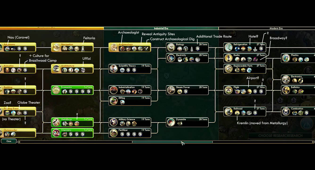
Civ V Technology Tree


- When you die, I didn't realize that clicking on the corpse of your character would restart that level. Is that a feature or a bug? If a feature, you should mark it with a "Try Again" button or something.
- Also when you die, you have "Exit Game" instead of "Main Menu," even though you also explain on the screen that clicking the button will return you to the menu. Why not just change the name of that button to "Main Menu" or whatever? Exit Game makes me think I'm going to return to my desktop and close the game.
- Other confusing thing: why is a -1 shown when you're deconstructing trees/rocks/whatever? Do resources have HP? It's more confusing than it is helpful. I can already see that the durability of the resource is decreasing with the purple bar.
- Consider changing how items are combined -- clicking and dragging can be an accessibility issue. Here's a passage from Game Accessibility Guidelines:
Ensure that multiple simultaneous actions (eg. click/drag or swipe) are not required, and included only as a supplementary / alternative input method:
Holding something down rather than tapping causes difficulty for one group, and moving in a precise direction causes problems for another, so combining the two into a drag or swipe multiples the issue.Other people rely on and enjoy these controls and find simple controls frustrating or less intuitive, so if you can, allow both.
_________________________
Apologies for the short post! Busy these days. I've got choir, jujitsu, rock climbing, D&D, and board game stuff going on. And work. That too. I'll try to keep up with the schedule, though!
I'll also be writing a bit more about usability as a whole, as I did with the two prior posts. I've been saying I'd for a while write about designing a game with usability in mind, but I feel like I need to read more up on accessibility literature to really give that topic justice. I'm going to start reading http://gameaccessibilityguidelines.com/.


0 comments:
Post a Comment